
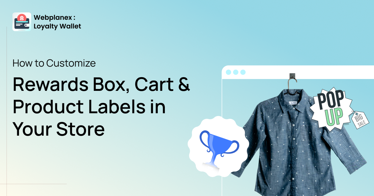
Customizing the Redeem Rewards Box on your cart
New Feature

Your customers notice everything. The color of a button. The tiny label sitting next to a product. The rewards box on the cart page can either be inconspicuous, like a chameleon, or pop out like a traffic sign. Individually, they might not seem like big matters, but the combo of these two shapes can make a store look trustworthy, polished, and the author intended to make someone visiting it for the first time or the tenth time. In the past, most of these visual styles were just... static. You worked around them, or you didn't touch them at all. That's changed. The recent upgrade of the Loyalty Wallet application has included three newly added customization features that will allow you to have full control over how your cart, product labels, and rewards box look without the need to write a single code line.
This is the summary of their operation, together with a few tips on how to use them effectively. With this article, you will understand each one of them, and you will learn primarily how to get the most out of them.
New Feature
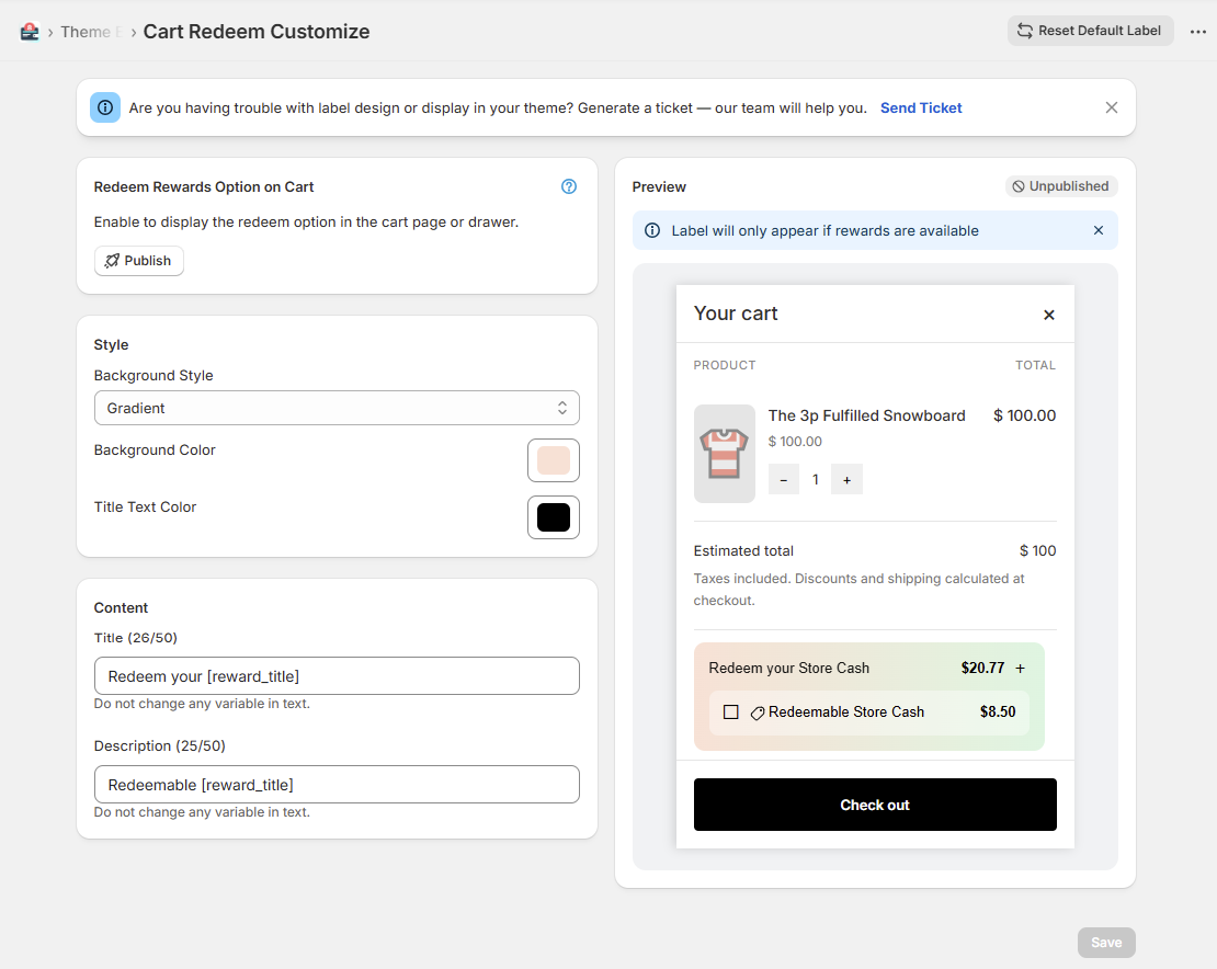
Adjust colors, text, and styling for the Redeem Rewards box on your cart page or drawer, with a live preview before anything goes live. Get started via Theme Elements.
The Redeem Rewards box sits right at the decision point. Your customer is already on the cart page, they're close to checking out, and that little box either nudges them forward or gets completely ignored because it looks out of place.
A generic-looking rewards widget sends a quiet signal: "third-party plugin." A customized one that matches your store's colors and speaks in your brand's language? That feels like part of the experience you built. And that distinction matters more than people give it credit for. With this new update, you can head into Theme Elements and dial in exactly how that box looks. Change the background and text colors, update the copy, and match it to your existing design. The preview is instant, you see every change as you make it, so there's no guessing involved and no surprise after saving.
To access it, open the app and navigate to Theme Elements. The rewards box settings are clearly laid out, and even if you've never used a design tool before, the options are straightforward.
You might find helpful:
https://rewards.webplanex.com/how-to-build-loyalty-program-shopify.html
https://rewards.webplanex.com/how-to-use-reward-store-cash-boost-repeat-purchases.html
New Feature
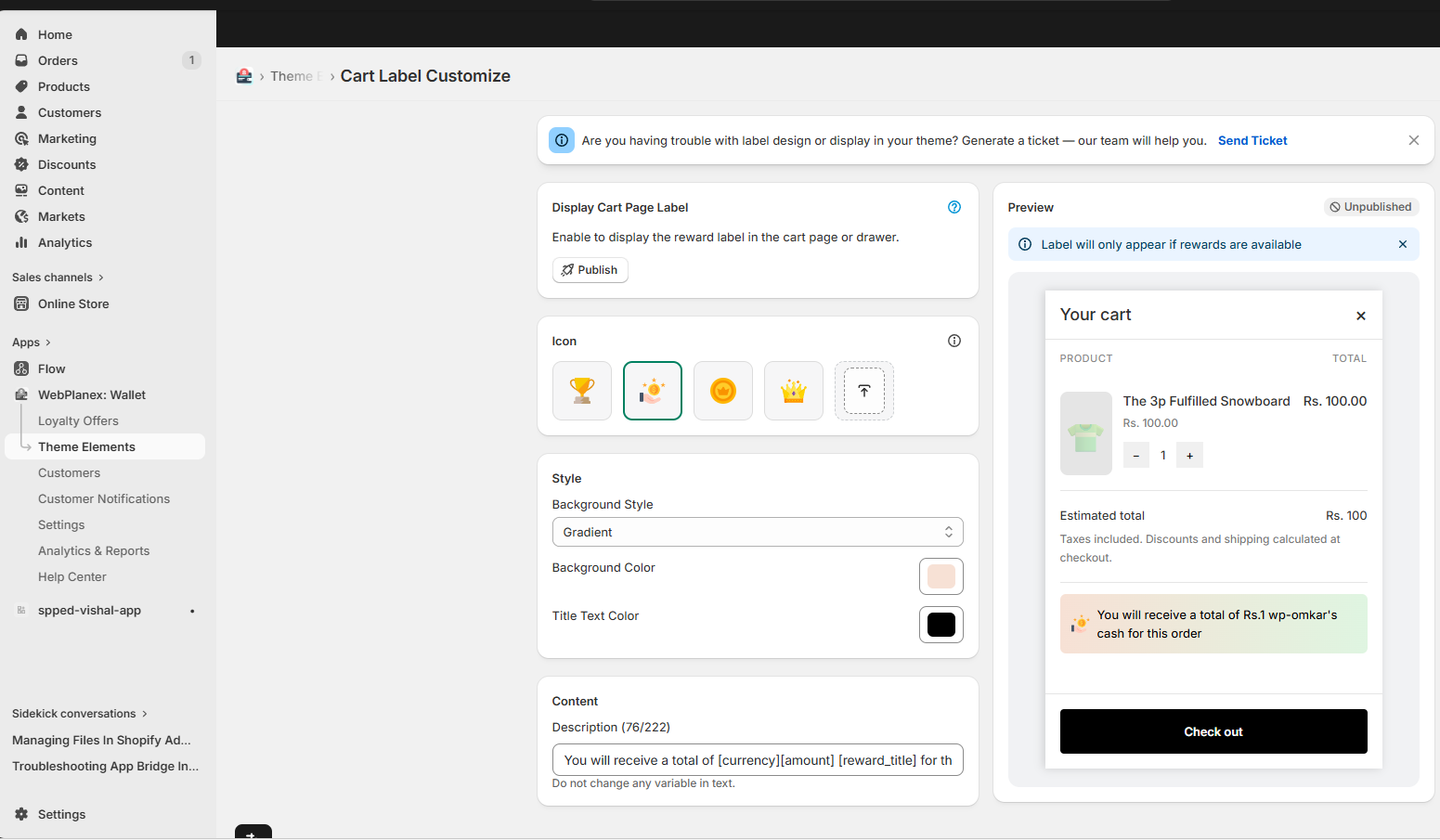
Pick icons, set colors, write your own text. Eye-catching cart labels that match your brand style, with live preview built in. No technical skills needed.
Labels on the cart page do a specific job, they pull attention toward something worth highlighting. A free shipping threshold. A time-sensitive offer. A loyalty points reminder. Slight movements at the correct time.
The problem has always been the fact that when a label is off-brand or looks clunky, it not only builds trust but also can actually undermine it. Customers see the inconsistency, even if they are unable to identify what feels wrong.
Now you have the option to create a cart label specific to your store. Select the icon, set the colors to your design's palette, and craft the label copy in your style. The live preview reveals the exact look of it before you give your permission to publish it, and thus, you always work with absolute visibility.
A few real ways stores are using this right now:
New Feature
New Feature
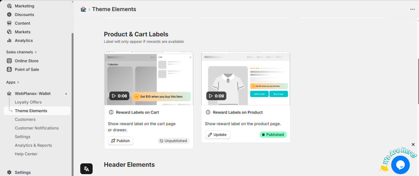
Choose icons, colors, and text for your product labels. Preview instantly, publish in one click. No developer, no code, just a few clicks to set up.
Product labels are small, but they carry real weight on the product page. A well-placed "Best Seller" badge can lift click-throughs on a listing. A "New Arrival" label tells shoppers where to look first without you having to rearrange anything. These little cues guide attention in a way that's genuinely effective when done consistently.
What's changed here is the level of control. Before, you were often stuck working with whatever the app defaulted to, a color that clashed, text that felt generic. Now you can create product labels that feel like they were specially designed for your store.
Here's a quick way to think about the setup process:
1. Decide which product attributes or behaviors you want to highlight, bestseller, new, low stock, on sale, etc.
2. Open the label editor inside the app and pick a matching icon or visual element
3. Set the colors to match your brand, your primary color, an accent, whatever fits the context
4. Write the label text in your store's voice (short works best, three words or fewer is the sweet spot)
5. Review the live preview, tweak if anything feels off, and save when it's right
The whole process takes maybe five minutes the first time, faster after that, once you've locked in a style that fits.
There's a version of customization that's purely cosmetic, and then there's this, which connects to how customers actually move through your store and make decisions.
A rewards box that matches your brand reduces friction at checkout instead of introducing a moment of visual hesitation. Cart labels that highlight the right offer at the right moment give customers a concrete reason to add more, or at least not remove what's already there. Product labels that look intentional make your catalog feel curated rather than like a random collection of listings.
None of these is a magic bullet. But small visual improvements compound. A store that feels cohesive and thoughtfully designed earns more trust, and more trust converts. That's the mechanic, and these features are a direct lever on it.
The best part is that all three are genuinely fast to use. You don't need a developer session or a support ticket. You open the app, make the changes, see them immediately, and move on with your day.
All three features are live right now. Head into the app to explore them, start with Theme Elements for the rewards box, then work through the cart and product label settings from there.
Download the app here: https://apps.shopify.com/cashback-sale-booster